Understanding the structure and properties of the theme.json file is fundamental for block theme development. This file serves as the primary configuration hub for all block-based themes.
Whether you’re building a theme from scratch, customizing an existing one, developing a style variation, or working on a child theme, grasping how to work with theme.json is essential.
Fortunately, JSON (JavaScript Object Notation) is a human-readable format with a hierarchical structure that organizes information from general to specific properties. In the context of theme.json, familiarity with Cascading Style Sheets (CSS) is more relevant than an in-depth knowledge of JavaScript.
This article aims to break down the primary and secondary (nested) properties in a theme.json file, focusing on the key settings and styles properties. These are the core elements of the file, and we’ll provide detailed explanations and code examples for each.
We’re building on the foundation laid in our previous article, Unleashing the power of theme.json: Customizing your WordPress theme like a pro, particularly in the section Working with theme.json file properties.
Info
For local theme development, you can use Kinsta’s development tool, DevKinsta, which lets you quickly set up a local WordPress environment and easily deploy it to your Kinsta account.
Kinsta also provides access to staging environments, enabling seamless management and refinement of your web projects. This can be particularly helpful when testing changes to your theme, including updates to the theme.json file.
How styles are rendered in a block theme
WordPress uses a built-in cascading process to render styles for a site. When multiple sources define the same setting or style, WordPress must determine which one takes precedence. Below is the order of precedence that WordPress follows to decide which styles are applied:
WordPress core —The fallback theme.json file is in the wp-includes directory. This file is updated with major WordPress releases and should not be edited.
Theme — The primary theme.json file used by theme developers to define the theme’s settings, styles, and other properties.
Style variations — If a theme includes style variations, each has its own theme.json file stored in the theme’s styles subdirectory.
Child theme — As with classic themes, a child theme can modify a parent theme without altering its files (optional).
Child theme style variations — Similar to regular style variations, a child theme can have its own theme.json file in its styles subdirectory (optional).
User-created styles — These are custom styles added through WordPress editors (for pages, posts, or the site as a whole) and stored in the database.
The cascading order ensures that styles from higher-priority sources override those from lower-priority ones. For example, settings in the theme’s theme.json file will override the core WordPress theme.json. Likewise, a child theme’s style variation will precede the parent theme’s style variation.
User-created styles (6) hold the highest priority, overriding all other styles in the cascade.
In this article, our focus is on the theme.json file located in the root directory of any WordPress block theme.
A reference for primary properties and their key-values
Let’s explore the seven top-level objects in theme.json, which we’ve grouped into three sections to make the information easier to comprehend.
A few definitions before we dive in
When working with theme.json, you will likely find varying definitions for important components. For clarity, here’s how we define them in this article:
Sections — Groupings of top-level options (also referred to as “top-level objects” in some articles).
Objects — The primary elements in the theme.json file, such as settings and styles.
Properties — The components within objects. For instance, the settings object contains 12 different properties.
Key-value pairs — Properties are made up of key-value pairs. A “key” represents a property attribute and is enclosed in quotation marks. A “value” can be a boolean, string, or array.
When we mention “by default,” we refer to the default configurations in the core theme.json file, located at wp-includes/theme.json.
Finally, “users” refers to anyone using the WordPress Admin who can modify settings in the site, page, or post editors.
Syntax overview
Booleans are not enclosed in quotes.
Strings are enclosed in double-quotes.
Arrays are wrapped in square brackets [].
Objects are enclosed in curly braces {}, containing multiple properties or nested objects.
Commas are used to separate multiple key-value pairs within an object.
Here is an example of typical syntax:
{
“house”: {
“rooms”: “kitchen”
}
}
Grouping the properties
We’ve organized the properties into three sections for easier navigation:
Basic properties
Settings and styles properties
Templates and patterns properties
To simplify examples, we’ve sometimes omitted the outer object wrappers. Instead of showing the entire structure:
{
“settings”: {
“appearanceTools”: false,
“background”: {
“backgroundImage”: true
}
}
}
We might shorten it to:
“appearanceTools”: false,
“background”: {
“backgroundImage”: true
}
Info
Some examples are used to illustrate concepts and may not represent practical usage in theme development.
Basic properties
At the beginning of a theme.json file, you’ll typically find two key properties: $schema and version. These properties are usually placed at the top of the file. The current schema version is 3, introduced with WordPress 6.6.
“$schema”: “https://schemas.wp.org/wp/6.6/theme.json”, “version”: 3
Settings and styles properties
If you are familiar with classic themes, consider the settings property as features and functions that would generally be set in the functions.php file and exposed in the Appearance > Custom section of the WordPress admin.
Styles, on the other hand, are similar to the CSS properties that used to reside in the styles.css file, controlling the theme’s layout and design.
Settings
Except for the block and elements properties, all other settings are global. Since many of these settings are booleans, they act as toggles to enable or disable a UI feature.
It’s important to note that not all keys apply in every context. For instance, it’s not possible to allow users to set a minimum height for a paragraph block.
Appearance tools
These settings can be enabled collectively or individually by using “appearanceTools”: true.
Enabling this feature exposes various UI options in the WordPress editor, saving developers time. By default, these tools are disabled (“appearanceTools”: false).
Keys within appearanceTools include:
background
backgroundImage — Allows the user to add a background image to blocks.
backgroundSize — Defines how the background image is scaled (cover, contain, etc.).
border
color — Enables color selection for borders.
style — Lets the user choose the border style (solid, dashed, dotted, etc.).
width — Controls the thickness of the border.
radius — Allows users to set rounded corners by adjusting the border radius.
color
link — Enables setting a color for links within the content.
heading — Lets users define colors for heading tags (<h1>, <h2>, etc.).
button — Controls the color of buttons in the theme.
caption — Allows setting a custom color for captions.
dimensions
aspectRatio — Lets users control the width-to-height ratio of blocks.
minHeight — Enables setting a minimum height for blocks.
position
sticky — Allows the user to make a block sticky, meaning it stays fixed in place while scrolling.
spacing
blockGap — Controls the spacing between blocks.
margin — Lets users adjust the margins around a block.
padding — Controls the padding inside a block, defining the space between its content and its border.
typography
lineHeight — Allows users to adjust the line height (space between lines of text) for better readability.
Example: If you want users to add a background image while keeping other appearance tools disabled, use:
“appearanceTools”: false,
“background”: {
“backgroundImage”: true
}
Blocks
The blocks property allows users to enable settings per block, which can override global settings.
Example: If appearanceTools is set to false, but you still want to expose border controls for a block, use:
“border”: {
“color”: true,
“style”: true,
“width”: true,
“radius”: true
}
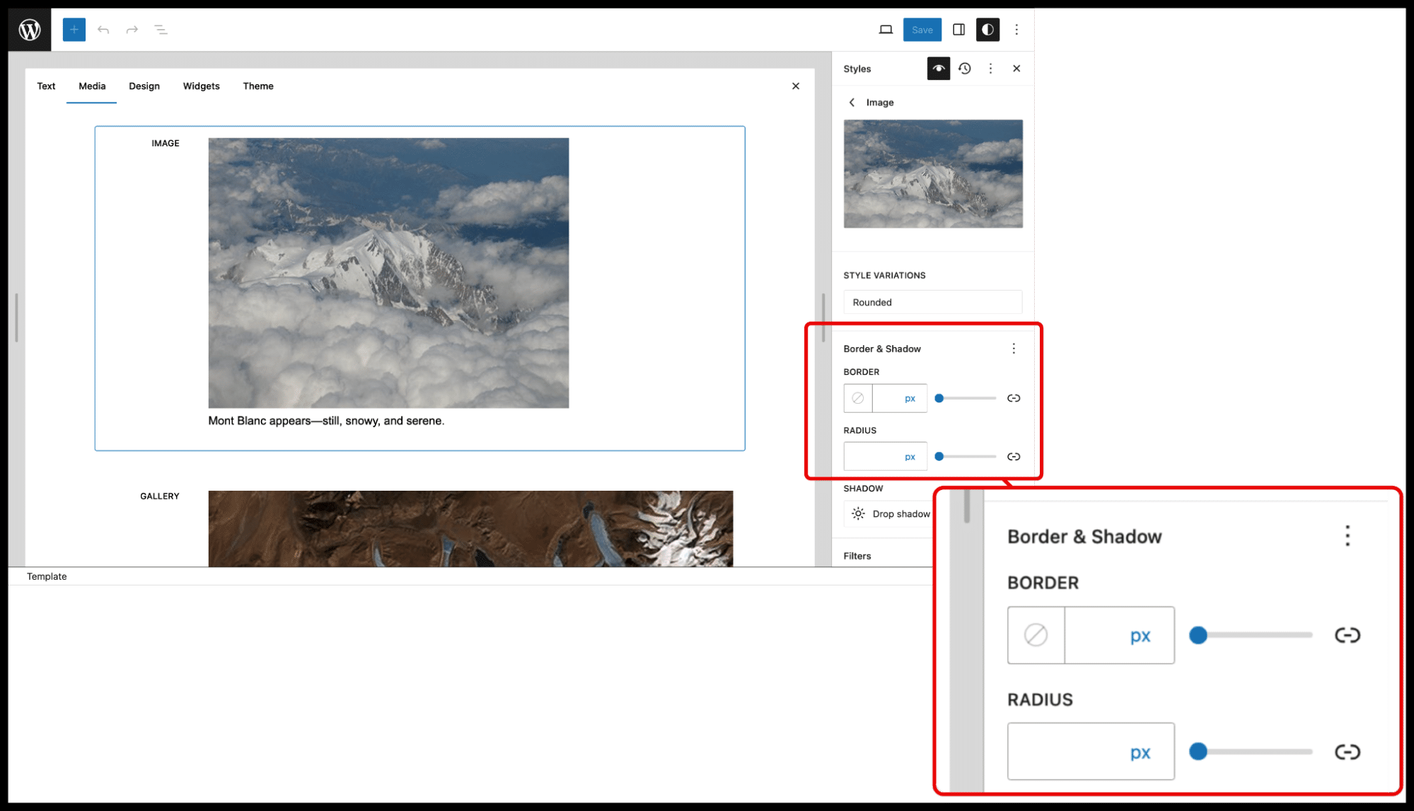
Color
This property lets users set color options such as background color, text color, or gradients.
Keys within the color property:
background — Controls the background color of blocks or elements.
custom — Enables or disables the ability for users to select custom colors.
customDuotone — Allows users to apply custom duotone filters to images.
customGradient — Enables custom gradient options.
defaultDuotone — Provides default duotone image filter options.
defaultGradient — Defines the default gradient options available to users.
defaultPalette — Controls the default color palette for the theme.
duotone — Allows duotone filters on images.
gradient — Enables gradient options for backgrounds or other elements.
link — Sets the color for links in the theme.
text — Controls text color options.
heading — Sets colors for headings (e.g., h1, h2, etc.).
button — Controls button color options.
caption — Sets the caption color for media elements.
Let’s explore some examples:
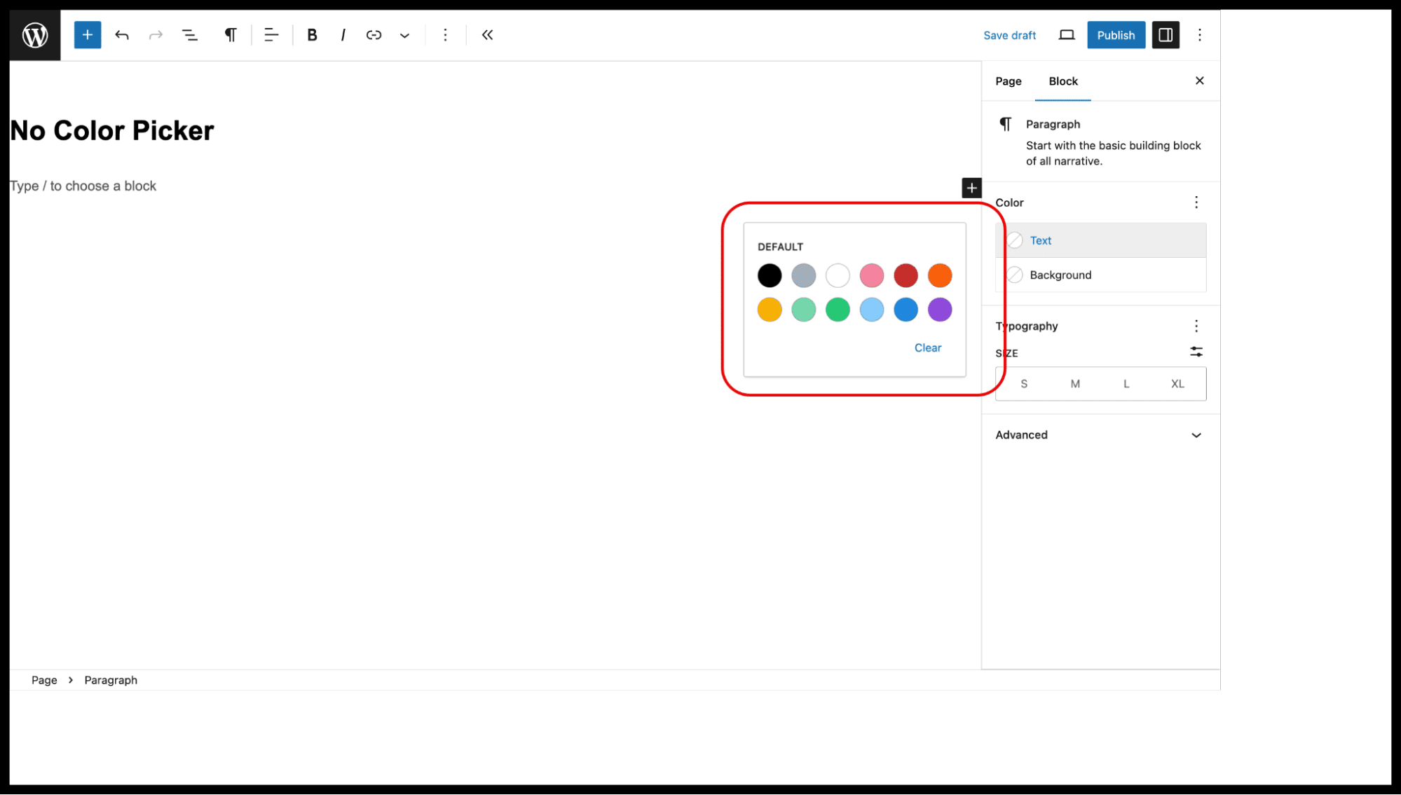
Example 1: If you want to disable the color picker for users, you can use the following:
“color”: {
“custom”: false
}
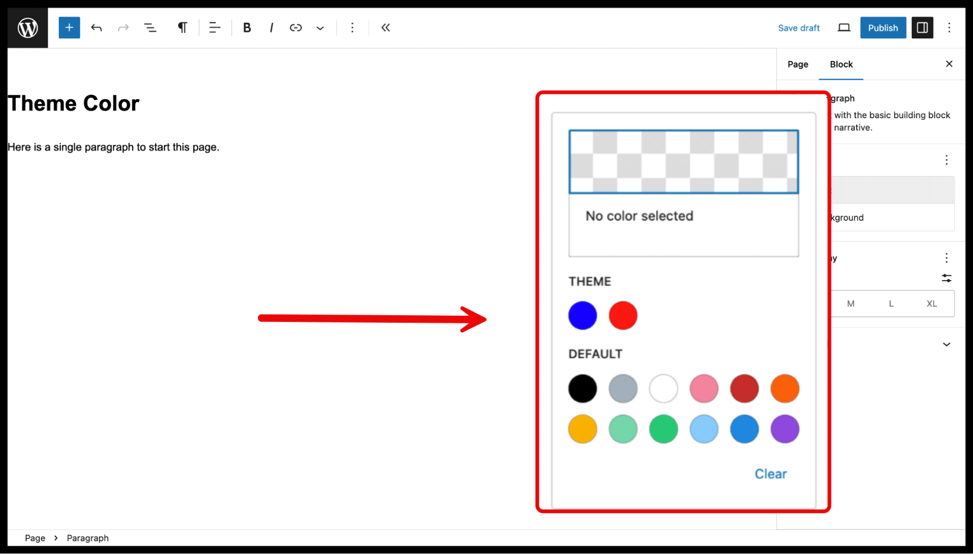
Example 2: To set custom primary and secondary theme colors, you can use this configuration:
“color”: {
“palette”: [
{ “slug”: “primary”, “color”: “#0000ff”, “name”: “Primary” },
{ “slug”: “secondary”, “color”: “#ff0000”, “name”: “Secondary” }
]
}
Dimensions
This property provides options to control block dimensions, such as width, height, and aspect ratio.
Keys within the dimensions property:
aspectRatio — Allows users to set or lock the aspect ratio of a block (e.g., 16:9, 4:3).
defaultAspectRatios — Defines default aspect ratios for blocks.
minHeight — Enables the ability to set a minimum height for blocks.
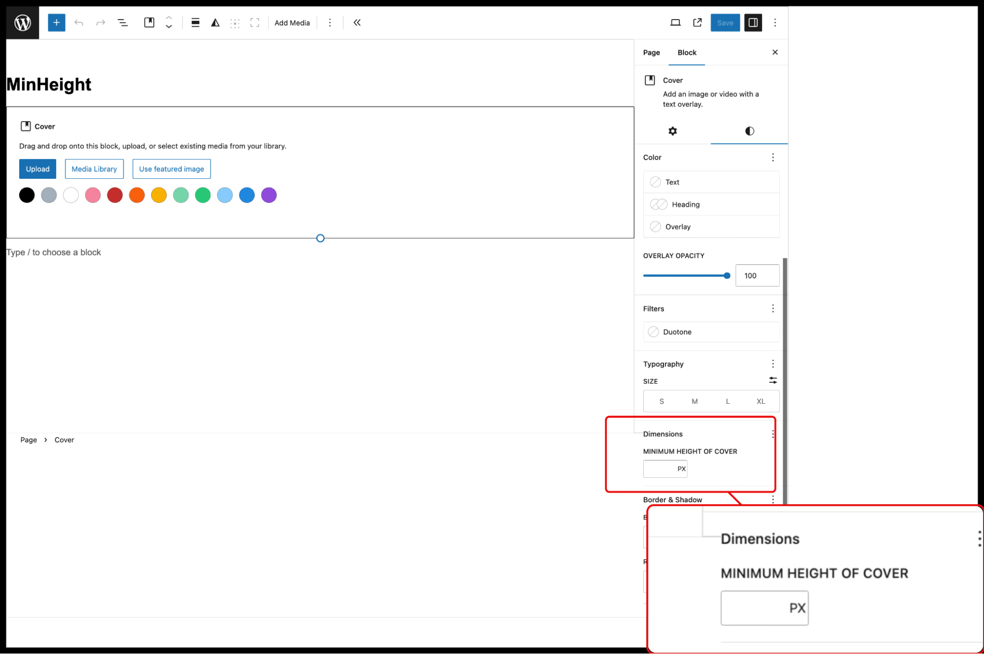
For example, to allow users to set a minimum height for supported blocks, use the following:
“dimensions”: {
“minHeight”: true
}
Layout
The layout property allows users to set layout-related options, such as content width and whether users can customize the layout. This allows users to set layout options with these keys:
contentSize — Sets the default width of blocks.
wideSize — Defines the width of blocks when the wide alignment option is selected.
allowEditing — Determines whether users can edit layout options.
allowCustomContentAndWideSize — Enables the customization of contentSize and wideSize.
Example: Configure layout settings with default and wide block widths:
“layout”: {
“contentSize”: “620px”,
“wideSize”: “1000px”
}
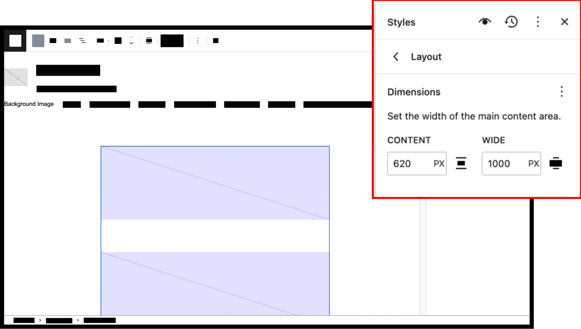
Info
These values are starting points that users can change.
Lightbox
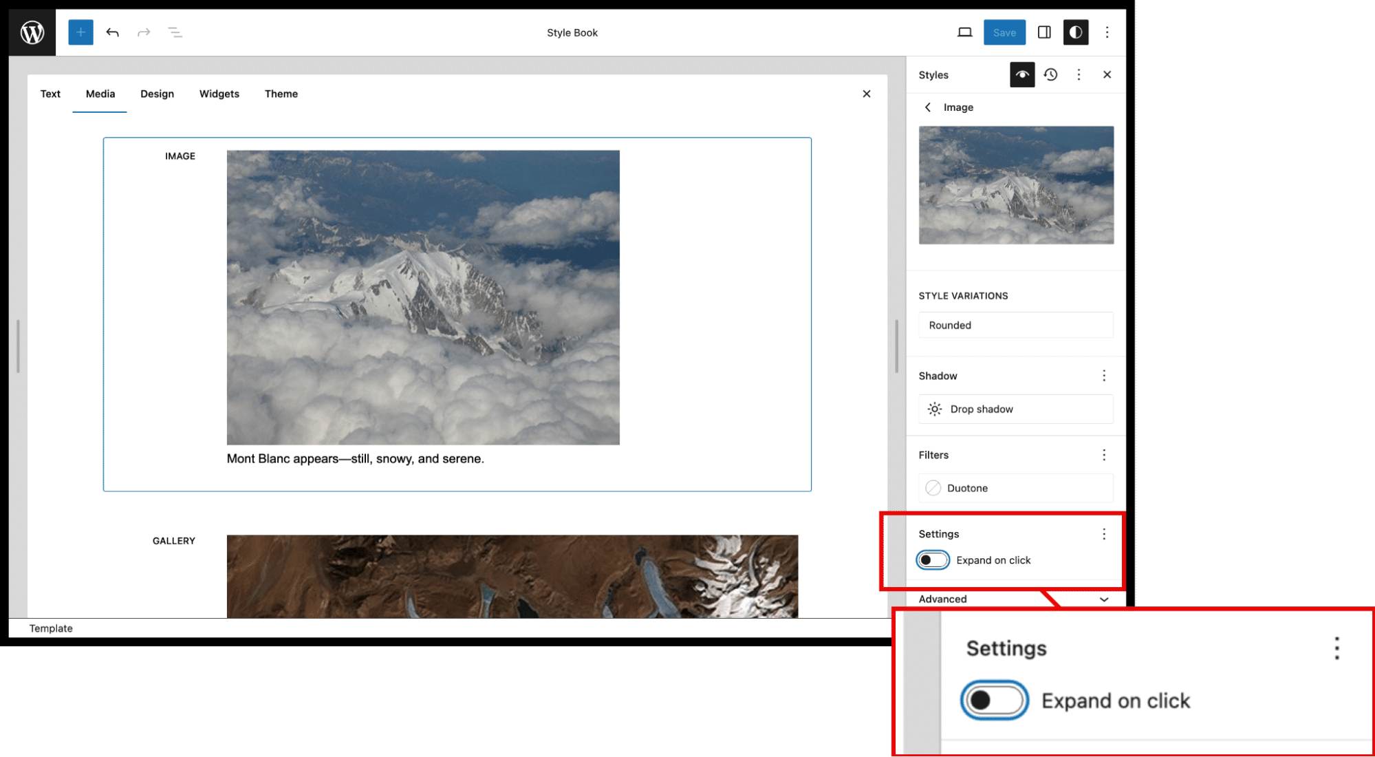
The lightbox property allows users to enable the “Expand on click” feature for images, opening them in a larger view when clicked.
Keys within the lightbox property:
enabled — Enables or disables the lightbox feature.
allowEditing — Allows users to toggle the lightbox setting.
Example: To allow users to toggle the lightbox feature for images, use this configuration:
“blocks”: {
“core/image”: {
“lightbox”: {
“allowEditing”: true
}
}
}
Position
The position property allows users to control the position of blocks, such as making a block sticky on the page.
Example: Make a block sticky:
“position”: {
“sticky”: true
}
Shadow
This property lets users apply shadow effects to blocks, either by using predefined presets or custom-defined shadows.
Keys within the shadow property:
defaultPresets — Enables or disables default shadow presets.
presets — Allows users to define custom shadow presets.
Here’s an example where default shadows are turned off, and a custom shadow named “Natural” is defined:
“shadow”: {
“defaultPresets”: false,
“presets”: [
{ “name”: “Natural”, “slug”: “natural”, “shadow”: “6px 6px 9px rgba(0, 0, 0, 0.2)” }
]
}
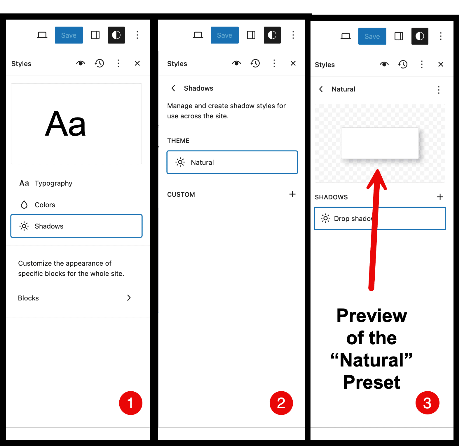
The numbers indicate the click-steps taken in the site editor to demonstrate the UI. The final step shows the “Natural” shadow.
Spacing
This property defines how spacing (padding, margin, gap) is controlled in the editor.
Keys within the spacing property:
blockGap — Controls the gap between blocks.
margin — Allows users to set margins around blocks.
padding — Provides options to set padding inside blocks.
units — Defines the available units for spacing (e.g., px, rem).
customSpacingSize — Allows users to set custom spacing sizes.
spacingSizes — Defines a range of preset spacing sizes.
spacingScale — Allows for scaling of spacing units.
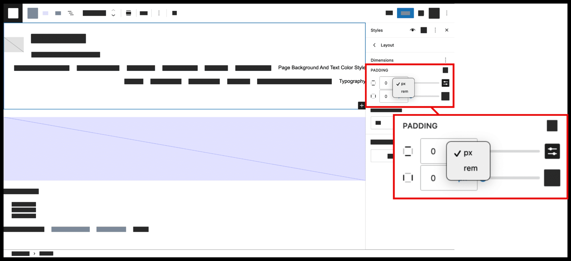
Example: To limit users to two units of measurement (pixels and rem) for padding, margins, widths, and heights, and to expose the spacing controls in the site editor, set appearanceTools to true and configure like this:
“spacing”: {
“units”: [“px”, “rem”]
}
Typography
This property controls the text-related settings for your theme, such as font size, weight, and line height.
Keys within the typography property:
defaultFontSizes — Defines the default font sizes available to users.
customFontSize — Enables or disables the ability to set custom font sizes.
fontStyle — Controls the style of the font (e.g., normal, italic).
fontWeight — Allows users to set the weight of the font (e.g., bold, light).
fluid — Enables fluid typography, adjusting font size dynamically based on screen size.
letterSpacing — Controls the spacing between letters.
lineHeight — Sets the height of each line of text.
textAlign — Allows control over text alignment (e.g., left, center, right).
textDecoration — Provides options for text decoration (e.g., underline).
writingMode — Sets the writing mode for the text (e.g., horizontal or vertical).
Example: To disable both custom font sizes and ropCap options, use the following:
“typography”: {
“customFontSize”: false,
“dropCap”: false
}
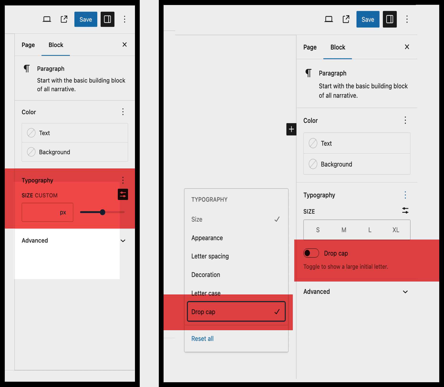
In this case, both of these highlighted keys will not appear in the editor.
Root padding aware alignments
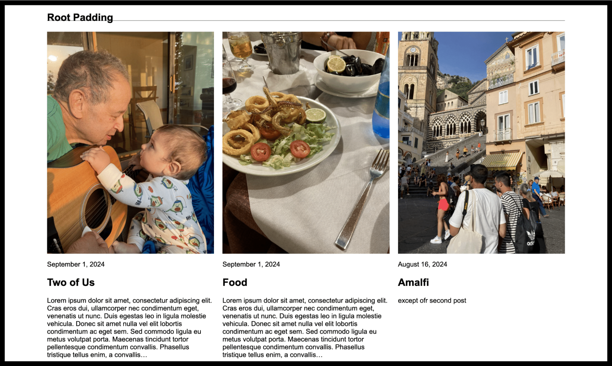
When set to true, this property ensures that wide or full-width block alignments are aware of the padding applied to the root element of the page (e.g., <html> or <body>), ensuring proper alignment even when padding is applied.
Example:
“useRootPaddingAwareAlignments”: true
Info
By default, this property is set to false, resulting in a flush design.
When set to true, you must also define the root’s top, right, bottom, and left padding values as a style. (More about style properties below).
“spacing”: {
“padding”: {
“top”: “0”,
“right”: “100px”,
“bottom”: “0”,
“left”: “100px”
}
}
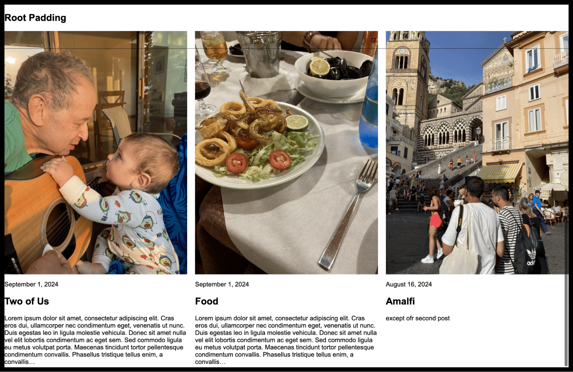
Applying the useRootPaddingAwareAlignements setting along with right and left padding to the body (as in the above code) results in the following.
Styles
The styles property allows you to apply CSS styles to the root (default), specific elements, or individual blocks in your theme.
Background styles
You can control background-related properties, such as images, positioning, and attachments.
Common keys for background:
backgroundImage — Defines the background image for the block or element.
backgroundPosition — Sets the position of the background image (e.g., center, top-right).
backgroundRepeat — Specifies whether the background image repeats (e.g., repeat, no-repeat).
backgroundSize — Controls the size of the background image (e.g., cover, contain).
backgroundAttachment — Specifies whether the background image is fixed or scrolls with the page.
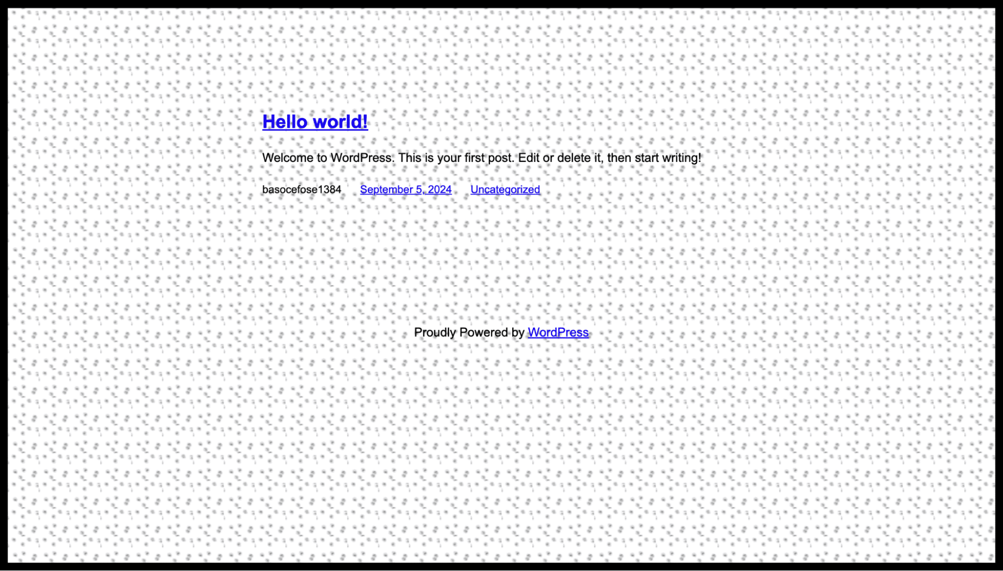
For example, you can set a background image for your theme:
“background”: {
“backgroundImage”: {
“url”: “https://joyofwp.com/wp-content/uploads/2024/09/dots.png”
}
}
Block specific styles
You can apply specific styles, such as shadow, typography, and borders, to individual blocks.
Keys for border:
color — Defines the color of the border.
radius — Sets the border-radius for rounded corners.
style — Specifies the style of the border (e.g., solid, dotted).
width — Controls the width of the border.
top, right, bottom, left — Allows you to set individual border styles for each side.
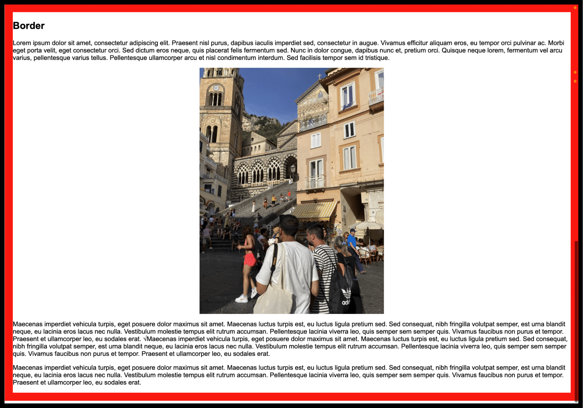
For example, the following sets a 20px solid red border around the entire page:
“border”: {
“color”: “#ff0000”,
“width”: “20px”,
“style”: “solid”
}
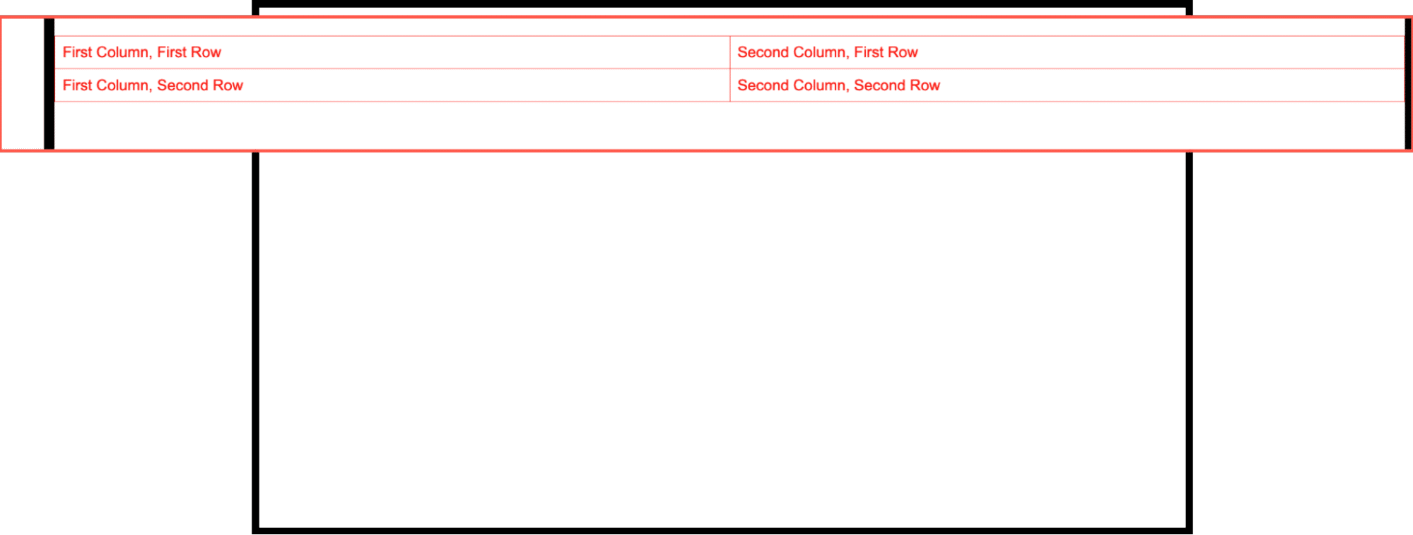
You can also assign custom CSS to a specific block, element, or the root.For example, the code below applies a red text color to a table block:
“border”: {
“color”: “#ff0000”,
“width”: “20px”,
“style”: “solid”
}
Color styles
The color property allows you to control background, gradient, and text color settings.Keys for color:
background — Sets the background color of the block or element.
gradient — Defines a background gradient for the block.
text — Controls the color of the text.
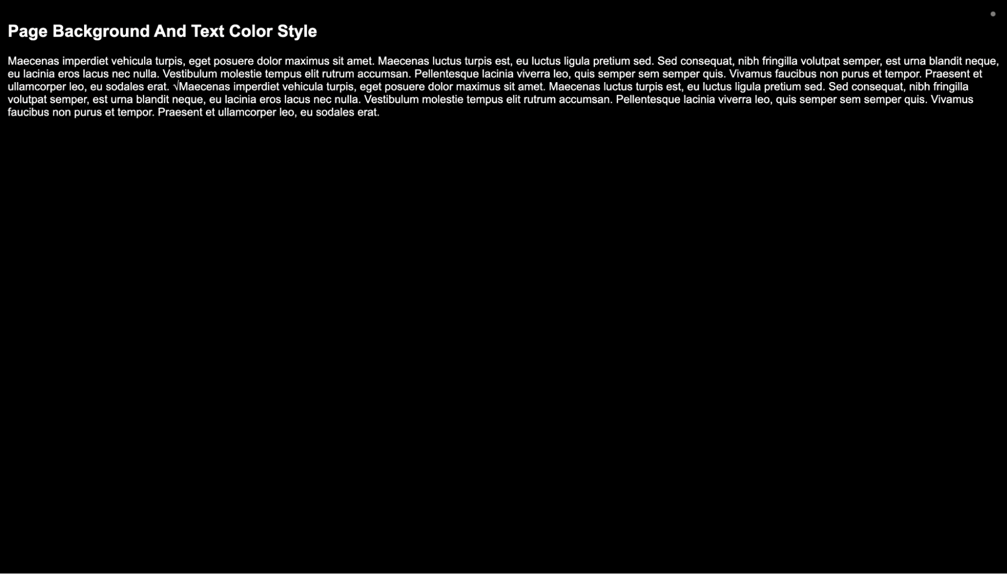
The example below sets a black background with white text on every element for every page:
“color”: {
“background”: “#000000”,
“text”: “#ffffff”
}
CSS
The css property lets you attach custom styles to specific classes, allowing more granular control over theme styles.
Example: Apply custom styles to wp-block-template-parts and wp-block-button, and add a hover effect for the button:
“css”: “.wp-block-template-part { background-color: #777777; padding: 20px; } .wp-block-button__link:hover { background-color: #ffffff; color: #000000; }”
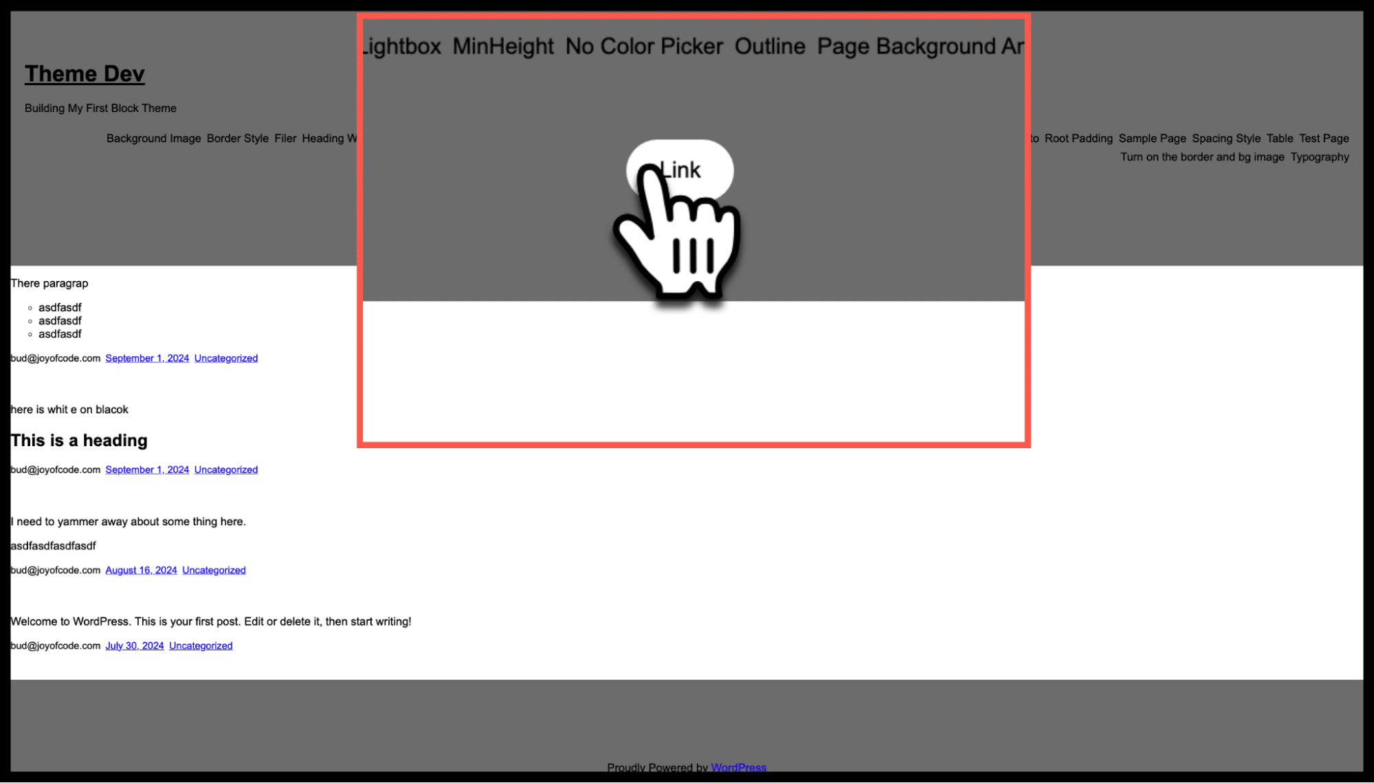
As you can see, the header and footer template parts are assigned background-color and padding, while the hover state for the button has a white background with black text.
Dimensions
The dimensions property allows you to control the width, height, and aspect ratio of blocks.
Keys for dimensions:
aspectRatios — Defines custom aspect ratios for elements.
minHeight — Sets the minimum height for blocks.
Example: Create a custom aspect ratio of 3:7 for an image block:
“blocks”: {
“core/image”: {
“dimensions”: {
“aspectRatio”: “custom”
}
}
}
However, the above alone is not sufficient. You must register the “custom” style within the settings sections.
“dimensions”: {
“defaultAspectRatios”: true,
“aspectRatios”: [
{
“name”: “Custom Ratio 3:7”,
“slug”: “custom”,
“ratio”: “3/7″
}
]
}
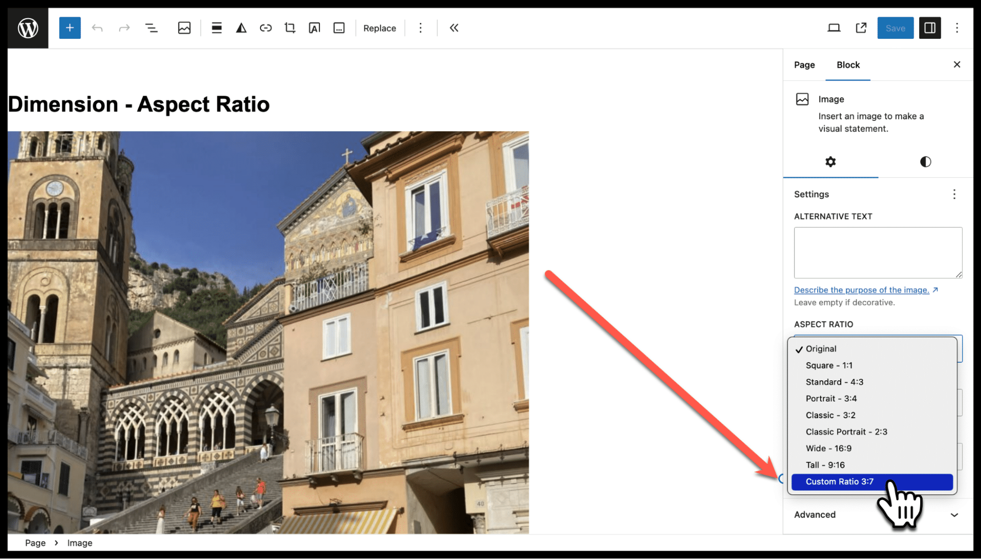
Here you can see that the “Custom Ratio” option has been added. If you prefer to remove the seven default aspect ratios, remove “defaultAspectRatios”:true from the settings section.
Element-specific styles
The elements property allows you to apply styles to specific HTML elements such as links, buttons, or headings.
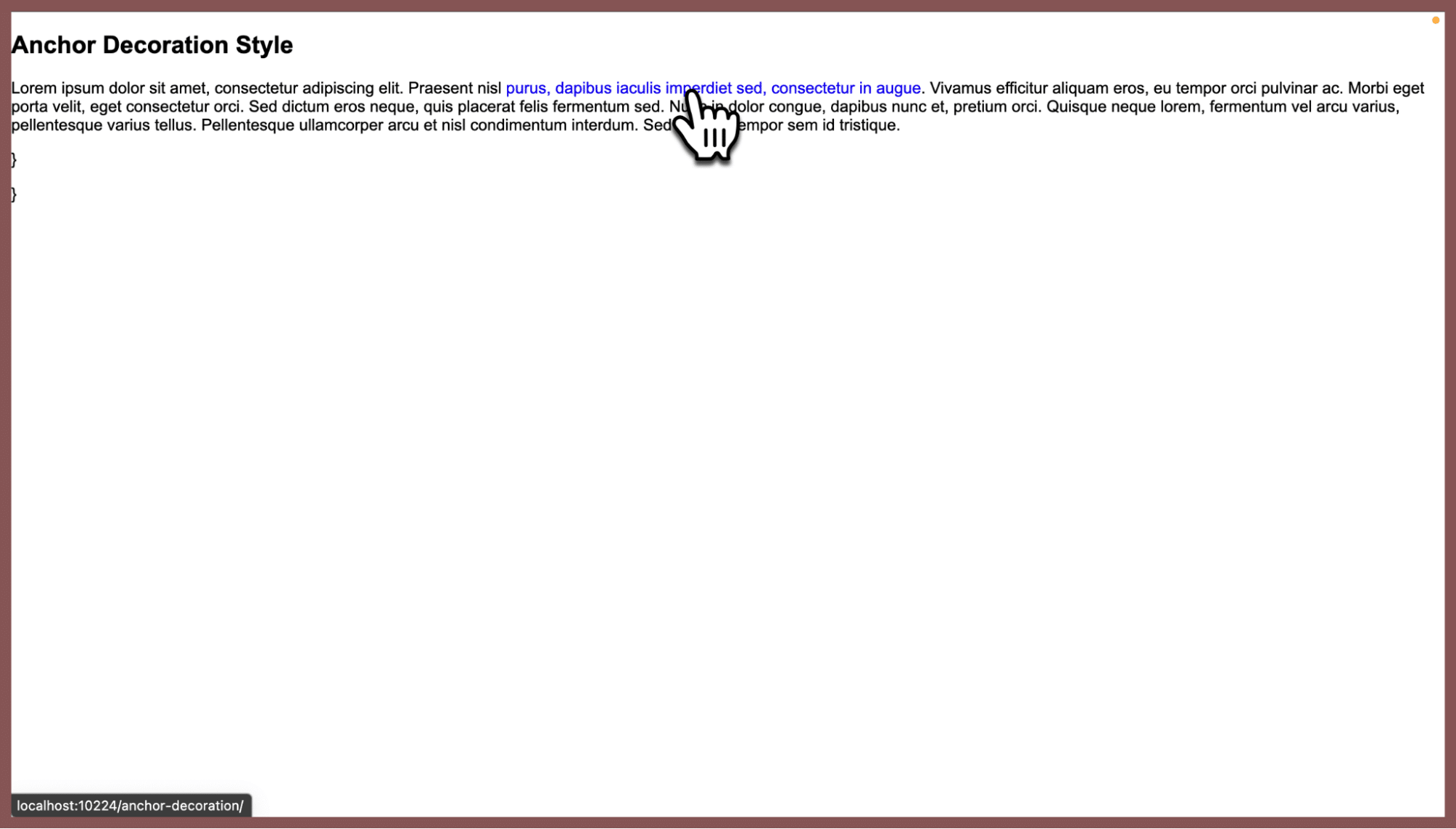
For example, the code below turns off text decoration (underlining) for all links:
“elements”: {
“link”: {
“typography”: {
“textDecoration”: “none”
}
}
}
Filter
The filter property allows you to apply CSS-like filter effects (e.g., blur, brightness) to certain blocks like images.
Example: Apply a blur and brightness filter to an image block:
“blocks”: {
“core/image”: {
“filter”: {
“duotone”: “blur(5px) brightness(0.8)”
}
}
}
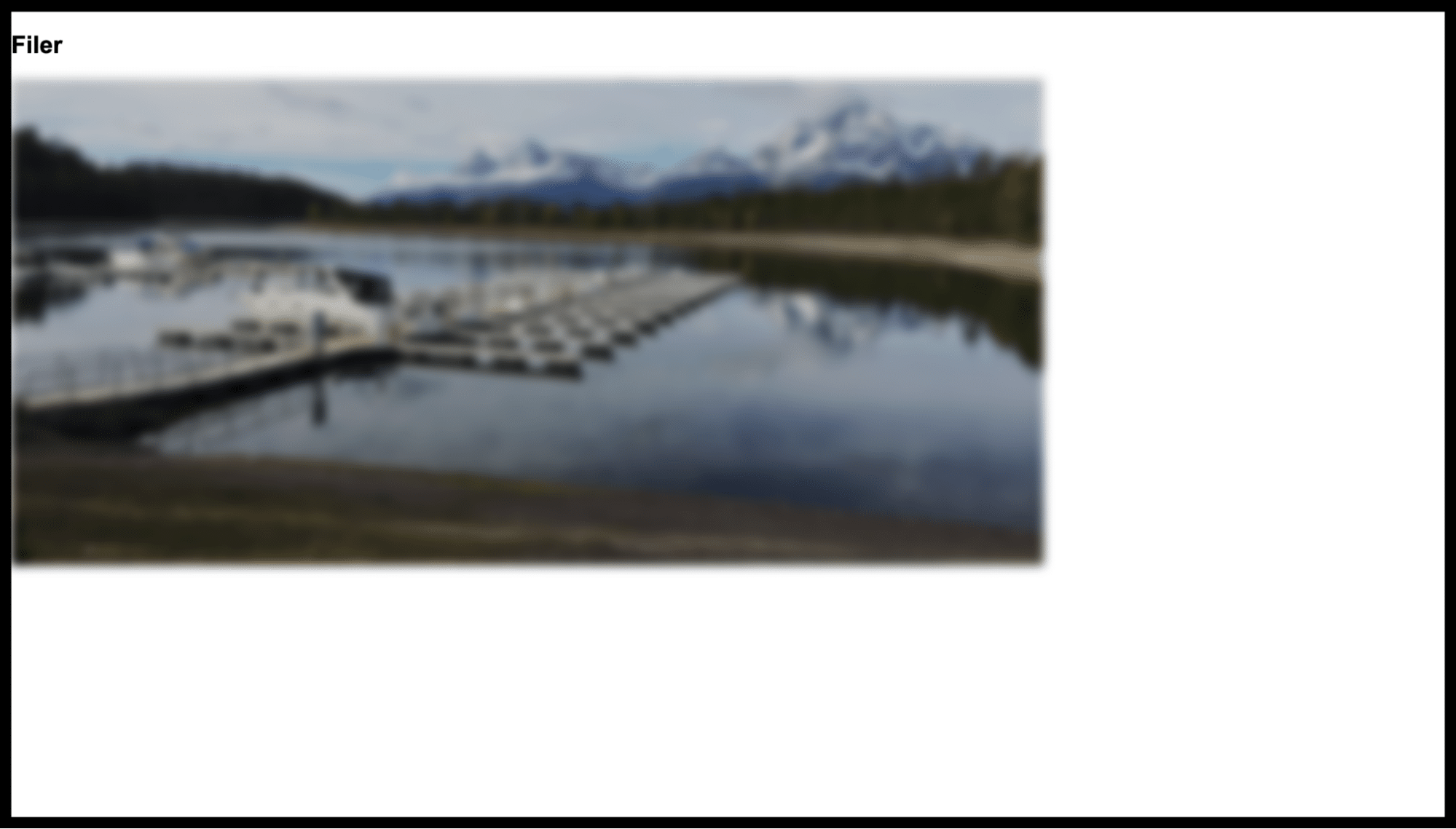
Here, blurring and brightness effects have been applied to the image block. Other available filter values include:
contrast — Adjusts the contrast of the element.
grayscale — Converts the element to grayscale.
invert — Inverts the colors of the element.
opacity — Controls the transparency of the element.
saturate — Increases or decreases the saturation of colors.
sepia — Applies a sepia tone to the element.
Outline
The outline property defines styles for outlines drawn outside the element’s border, without affecting layout space.
Keys for outline:
color — Sets the color of the outline.
offset — Controls the space between the border and outline.
style — Specifies the outline style (e.g., dotted, solid).
width — Sets the width of the outline.
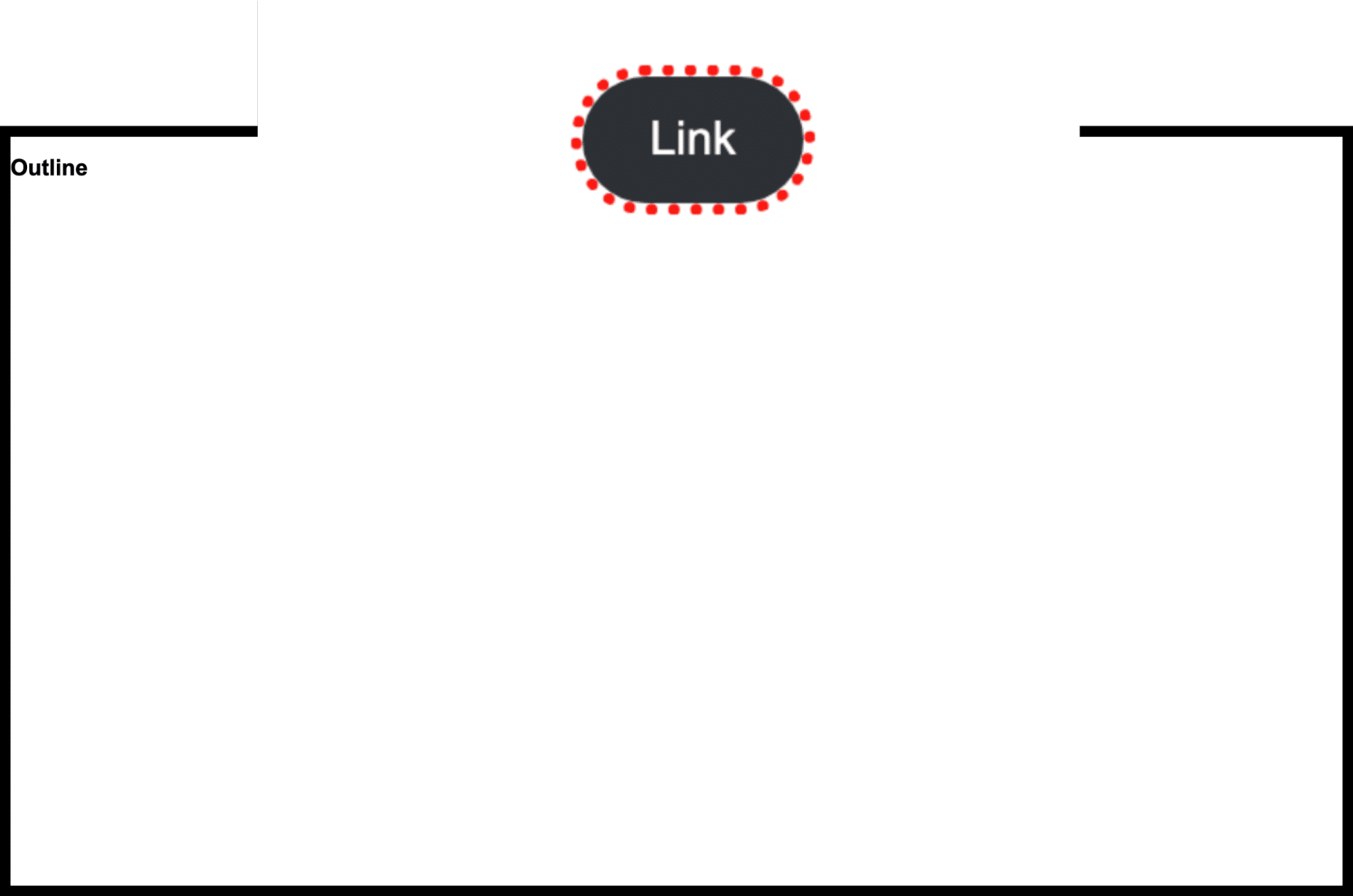
Example: Apply a red dotted outline to a button:
“elements”: {
“button”: {
“outline”: {
“color”: “#ff0000”,
“style”: “dotted”,
“width”: “4px”
}
}
}
Shadow styles
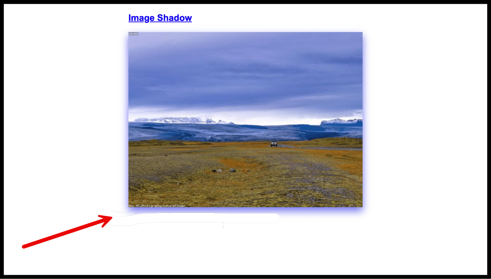
The shadow property allows you to apply box shadows to blocks, adding depth and emphasis to elements.
Example: Apply a shadow to all images:
“blocks”: {
“core/image”: {
“shadow”: “0 10px 20px 0 rgb(0 0 225 / 0.50)”
}
}
Spacing styles
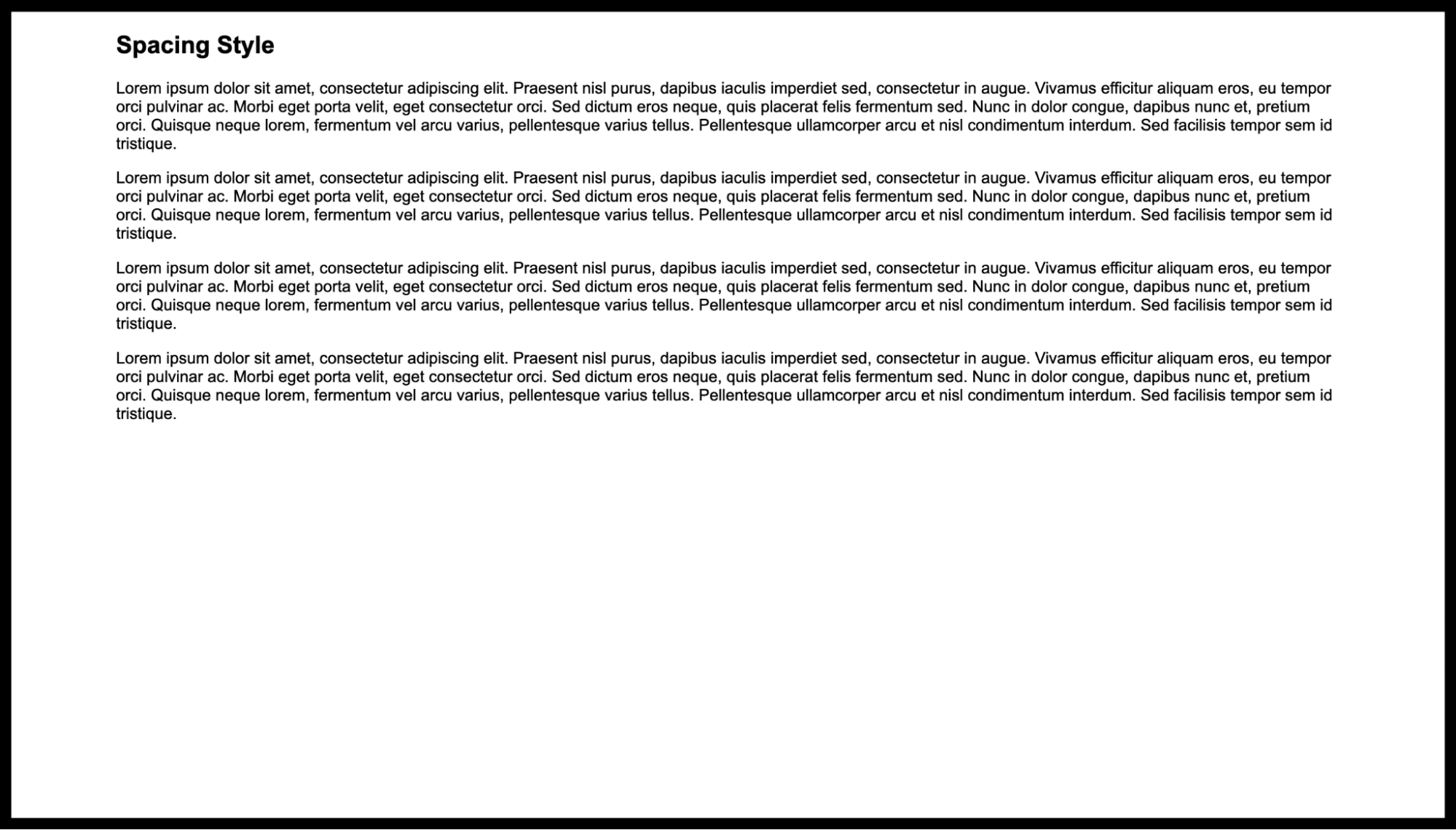
The spacing property manages the padding, margin, and block gap styles for your theme.
Keys for spacing:
blockGap — Controls the gap between blocks.
margin — Sets margins around blocks.
padding — Controls padding within blocks.
This example below sets custom padding on the left and right sides:
“spacing”: {
“padding”: {
“left”: “min(6.5rem, 8vw)”,
“right”: “min(6.5rem, 8vw)”
}
}
Typography styles
The typography property manages font styles, sizes, and other text-related settings.
Common keys for typography:
fontFamily — Sets the font family for the text.
fontSize — Defines the font size.
fontStyle — Specifies the font style (e.g., italic, normal).
fontWeight — Controls the weight (thickness) of the font.
letterSpacing — Adjusts the spacing between letters.
lineHeight — Defines the line height (spacing between lines of text).
textAlign — Sets the text alignment (e.g., left, center, right).
textColumns — Controls the number of text columns.
textDecoration — Sets the text decoration (e.g., underline).
writingMode — Defines the writing mode (e.g., horizontal, vertical).
textTransform — Controls the transformation of text (e.g., uppercase, lowercase).
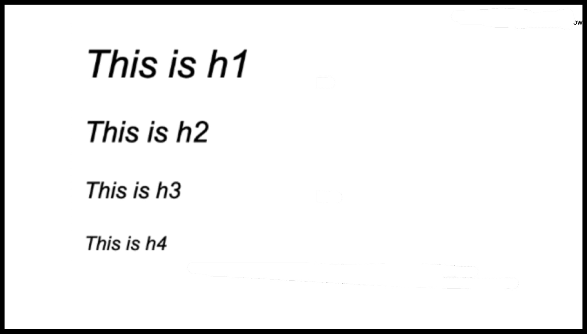
For example, you can set all headings to have a font-weight of 300 and an italic style:
“blocks”: {
“core/heading”: {
“typography”: {
“fontWeight”: “300”,
“fontStyle”: “italic”
}
}
}
Templates and patterns properties
These three top-level properties are used to register custom assets in your theme.
1. Custom templates
The templates property is used to register custom templates for various post types.
name — The name of the .html or .php file located in the templates subdirectory.
title — The title that will be assigned to the template for easier identification.
postTypes — Specifies the type of content (e.g., posts, pages) that the template is used to render.
2. Template parts
The templateParts property is used to define reusable parts of templates (e.g., headers, footers).
name — The name of the .html or .php file located in the parts subdirectory.
title — The title given to the template part for easier identification.
area — Specifies which part of the page the template part applies to (e.g., header, footer, sidebar).
3. Patterns
The patterns property allows you to register an array of pattern slugs from the WordPress Patterns Directory, making them available in the theme.
Here’s how to register a pattern:
“patterns”: [
“my-custom-pattern-slug”
]
Three practical examples of working with theme.json
Here are a few things you might wish to do for a theme you are developing.
1. Add a pattern
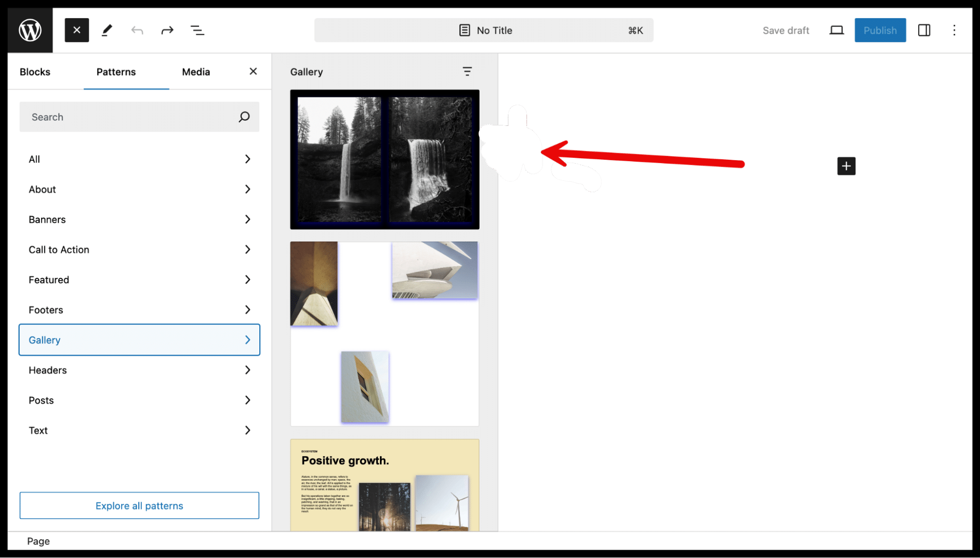
Here’s how to include two patterns from the WordPress Patterns Directory. Shown here is the “Fullscreen Cover Image Gallery” pattern:
“patterns”: [
“fullscreen-cover-image-gallery”,
“hero-banner-with-overlap-images”
]
Notes:
Patterns pulled from the Patterns directory will not display in the site editor’s Pattern section. These patterns will be available only through the Inserter.
In this example, we include the top-level property patterns (compared to settings and styles, which we omitted in previous examples for brevity).
2. Adding a custom font
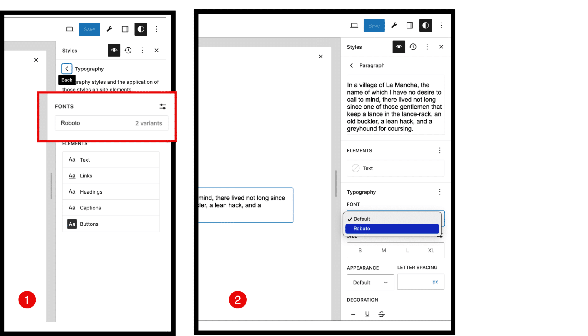
We downloaded two font files (Roboto-Regular.ttf and Roboto-Bold.ttf) from the Google Fonts library and uploaded them to our theme’s assets/fonts/ subdirectory.
The following code registers both fonts, making them available site-wide:
“settings”: {
“typography”: {
“fontFamilies”: [
{
“fontFamily”: “Roboto”,
“name”: “Roboto”,
“slug”: “roboto”,
“fontFace”: [
{
“fontFamily”: “Roboto Regular”,
“fontWeight”: “400”,
“fontStyle”: “normal”,
“src”: [
“file./assets/fonts/Roboto-Regular.ttf”
]
},
{
“fontFamily”: “Roboto Bold”,
“fontWeight”: “700”,
“fontStyle”: “bold”,
“src”: [
“file./assets/fonts/Roboto-Bold.ttf”
]
}
]
}
]
}
}
3. Setting your color palette
If you want to restrict your users to a specific color palette, you can configure it like this. (Gradients and duotones can also be configured according to your specifications.)
Example:
“settings”: {
“color”: {
“custom”: false,
“defaultPalette”: false,
“palette”: [
{
“slug”: “primary”,
“color”: “#1e8cbe”,
“name”: “Primary”
},
{
“slug”: “secondary”,
“color”: “#21759b”,
“name”: “Secondary”
},
{
“slug”: “tertiary”,
“color”: “#”,
“name”: “Tertiary”
},
{
“slug”: “accent”,
“color”: “#464646”,
“name”: “Accent”
}
]
}
}
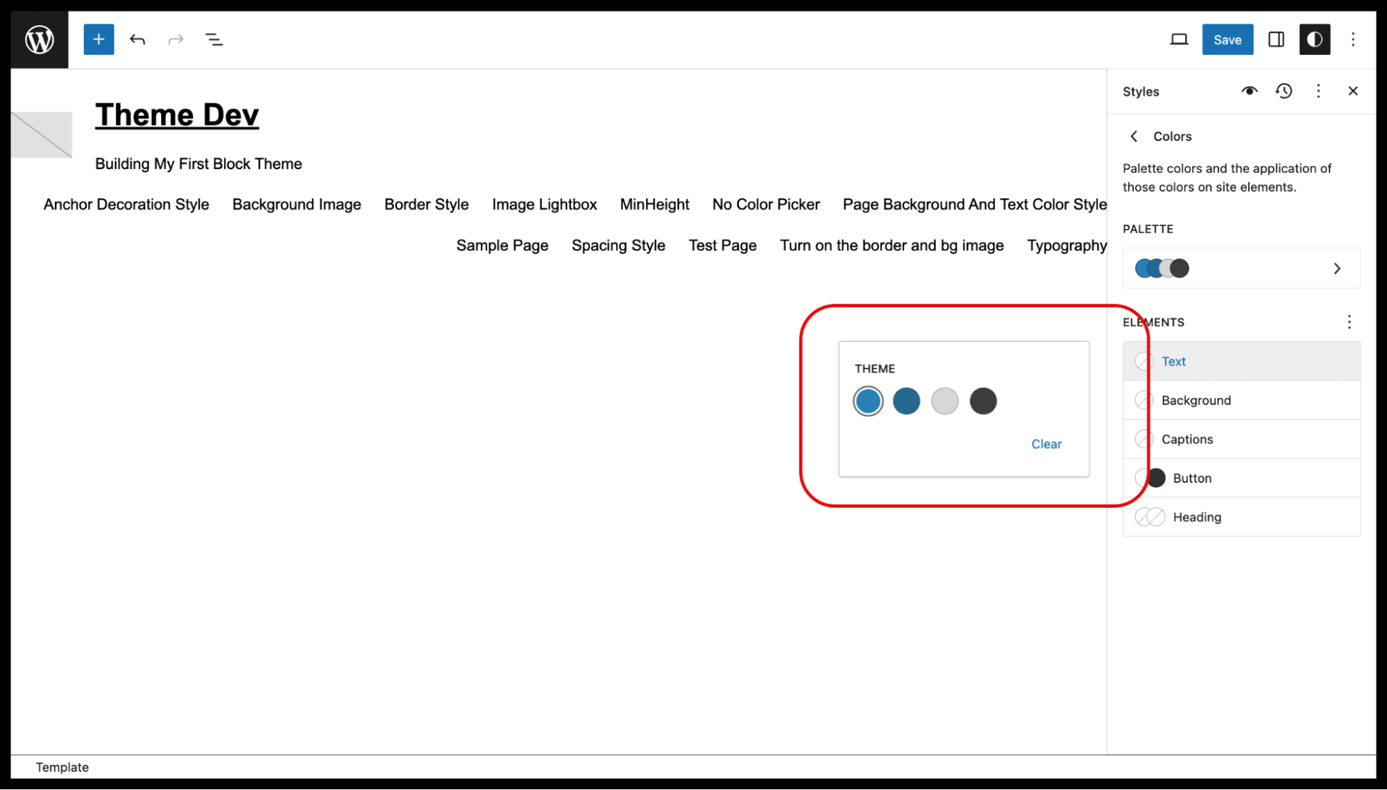
Recognize these four colors? They’re part of WordPress’ color story.
Summary
This article highlights the pivotal role of theme.json in modern WordPress theme development. By mastering theme.json, you can fully customize your theme’s visual design and user interface without needing complex PHP or CSS overrides.
Understanding how to effectively use properties like appearanceTools provides greater control and efficiency when building or refining WordPress themes, making this file an essential tool for developers looking to create flexible, user-friendly themes.
Power your site with Kinsta’s Managed WordPress hosting, crafted for speed, security, and simplicity. With Kinsta, you get:
Effortless control in the MyKinsta dashboard
Unlimited free migrations, handled by our expert migrations team
24/7/365 support from WordPress experts
Google Cloud’s premium infrastructure
Enterprise-grade security through Cloudflare integration
Global reach with 37 data centers
Enjoy your first month free!

